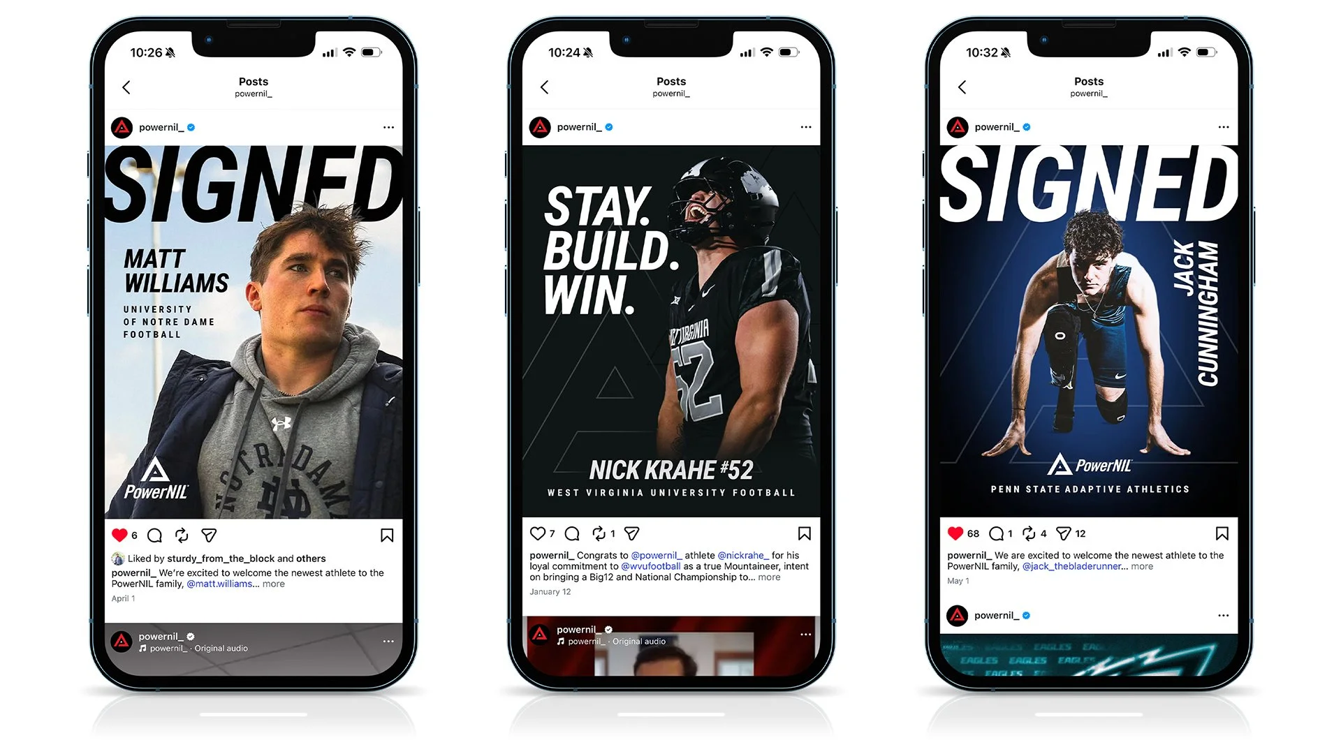
PowerNIL Identity Design & Branding System
This branding adventure began with developing the logomark.
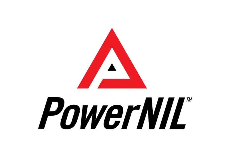
The PowerNIL logo combines two elements: the triangle logomark and the PowerNIL wordmark.
The triangle represents a fulcrum—a symbol of leverage. That idea sits at the core of what we do at PowerNIL: leveraging the value, influence, and likeness of our athletes to create meaningful opportunities and profitability for brands.
The strong angles of the logomark provided inspiration for other branding elements, such as PowerNIL motion wedges, which denote strength and power in motion.
The black and red color palette reinforces the brand’s identity—black representing strength and authority, while red signals power, intensity, and drive.
Logomark